

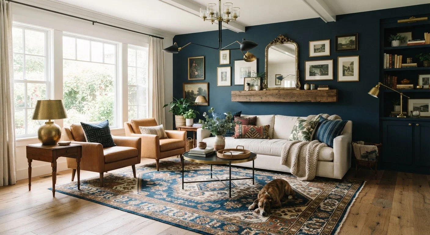
Why Decorating "Rules" Are Often Half-Truths
Home decorating advice circulates endlessly — through magazines, social media, and well-meaning family members. Some of it is grounded in genuine design principles. A lot of it isn't. Outdated rules get repeated until they feel authoritative, and homeowners end up making cautious, timid choices that leave rooms feeling generic instead of genuinely livable.
The goal here isn't to throw out all structure. Good design does rely on principles like scale, proportion, and light. But many of the most commonly cited "rules" are either oversimplified, misapplied, or just wrong. Understanding the nuance behind them frees you to make smarter, more confident choices — whether you're starting from scratch or refreshing a room that isn't working. See our planning checklist before you redecorate to work through the practical considerations before spending anything.
Myth
You should never mix metals — pick one finish and stick with it throughout a room.
Fact
Mixing metals is a standard technique in contemporary interiors; the key is intentional variation, not avoidance.
The fear of mixing metals — brass with chrome, matte black with brushed nickel — produces rooms that feel sterile and over-coordinated. In practice, varied metal finishes add visual interest and reflect how real spaces accumulate pieces over time. A common approach used by designers is to choose one dominant finish (roughly 60–70% of metal elements) and allow one or two others as accents. What makes it work is consistency elsewhere: shared undertones, a cohesive color palette, or repeated shapes.
Myth
Dark paint colors make a small room feel even smaller and should be avoided.
Fact
Dark colors can actually make a room feel more intimate, defined, and sophisticated — and in some cases, less cramped.
Light colors reflect light, but they also expose every corner and boundary of a small room, making its limitations obvious. A deep, saturated color on all four walls — including the ceiling — can blur those edges and create a sense of enveloping coziness rather than confinement. This technique, sometimes called a "cocoon" effect, works particularly well in dining rooms, home offices, and bedrooms. The bigger driver of perceived spaciousness is typically lighting quality and furniture scale, not wall color. See strategies for small living rooms for a fuller look at what actually works.
Myth
All furniture should be pushed against the walls to maximize floor space.
Fact
Floating furniture away from walls typically makes a room feel larger and more functional, not smaller.
Lining furniture against every wall creates a perimeter-hugging arrangement that leaves the center of the room empty and makes conversation awkward. Interior designers routinely pull seating inward to define zones, improve traffic flow, and create a sense of purposeful layout. Even in genuinely small rooms, a sofa floated 4–6 inches from the wall — or angled to define a conversation area — often reads as more spacious than the wall-hugging alternative. Furniture arrangement principles explain the underlying logic of why some layouts feel right immediately.
Myth
Patterns should never be mixed — choose one and keep everything else solid.
Fact
Pattern mixing is a well-established technique; it requires attention to scale and color, not avoidance.
A room with only solid colors and one pattern can feel flat and unfinished. Successfully mixing patterns relies on a few manageable principles: vary the scale (a large-scale floral with a small geometric, for instance), keep a consistent color thread running through all of them, and limit the total number to two or three. Stripes are particularly versatile as a bridge pattern. The result is a room that feels layered and considered — which is precisely what makes professionally designed spaces look expensive regardless of budget.
Myth
Wood tones throughout a room must all match exactly.
Fact
Matching all wood tones creates a matchy-matchy look that reads as dated; varied tones with a unifying element look more sophisticated.
Identical wood finishes on every piece of furniture — all golden oak, all espresso — tends to look like a showroom set rather than a curated home. Mixing warm and cool wood tones gives a room an organic, collected quality. The practical guideline is to keep undertones in the same family (all warm-toned or all cool-toned woods) rather than matching exact shades. A light maple floor paired with a darker walnut coffee table and a medium-toned oak bookshelf can feel entirely cohesive when the upholstery and textiles provide a through-line. Understanding interior design style categories can help clarify which wood combinations suit your broader aesthetic.
Rethinking What Makes a Room Feel Right
Once you let go of prescriptive rules, the real question becomes: what actually makes a room feel cohesive and comfortable? The answers come down to repetition, scale, and intention. A room feels pulled-together when colors, materials, and shapes echo each other — not because everything matches, but because choices relate to one another.
For example, mixing metals works beautifully when one finish dominates and others appear as accents. Mixing patterns works when they share a common color and vary in scale. Dark walls work when lighting is layered rather than relying on a single overhead fixture. These aren't loopholes in the rules — they're the actual principles the rules were clumsily trying to describe.
One Exception: Rental and Resale Contexts
If you're decorating a rental you'll vacate, or preparing a home for sale, some conventional "safe" choices — neutral walls, minimal pattern mixing — do serve a practical purpose. Broad buyer or tenant appeal is a legitimate goal that can justify more cautious decisions. But in a home you plan to live in, decorating for an imagined future buyer rather than your actual daily comfort is one of the most common sources of regret.
If a room still feels off after you've addressed furniture scale, color, and layout, the fix is often simpler than you think. Our guide on common decorating missteps that are easy to fix walks through the most frequent culprits. And if you want to understand why certain color choices feel wrong even when the paint chip looked right, color temperature is the concept worth mastering before your next paint decision.
Decorating well isn't about memorizing a longer list of rules — it's about understanding the underlying logic so you can apply it to your actual space, your actual budget, and your actual life.
68%
Homeowners who regret playing it too safe with color
According to a survey by Houzz, the majority of homeowners who completed a renovation wished they had been bolder with color choices.
~10 years
Average time between full room redecorations
Industry research suggests American homeowners redecorate a room roughly once per decade, making each decision worth getting right the first time.
The content on this site is for informational purposes only and is not a substitute for professional advice. Always consult a qualified professional for guidance specific to your situation.