

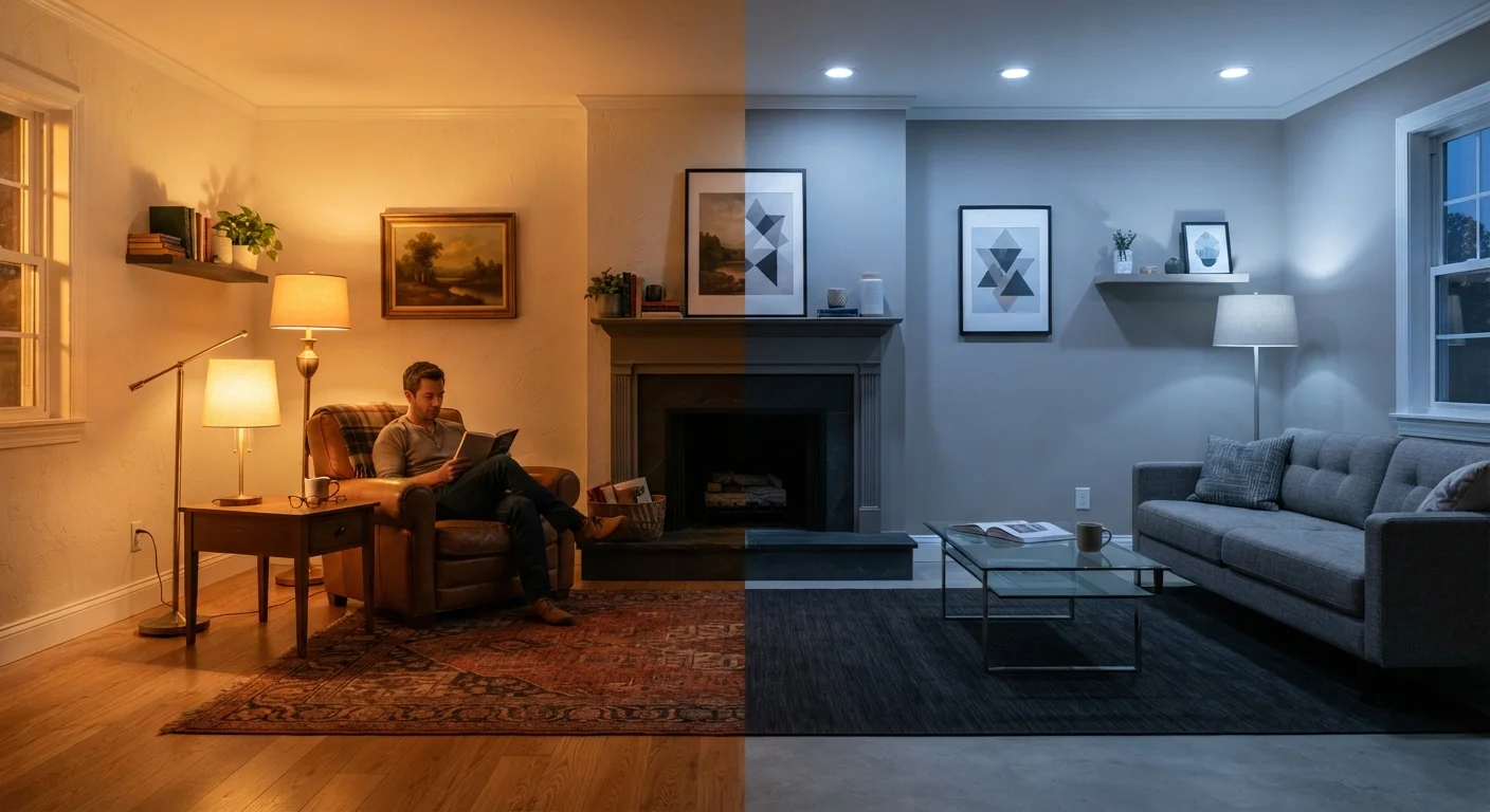
What Color Temperature Actually Means for Decorating
The phrase "color temperature" gets borrowed from lighting science and applied more broadly in décor to describe a spectrum from warm to cool. In practical terms, it governs two things simultaneously: the warmth or coolness of your light sources, and the underlying undertone of every surface in a room — your walls, your upholstery, your rugs, your trim.
When these two dimensions work together, a room feels effortlessly cohesive. When they clash — a cool-blue-toned gray wall lit by warm amber light, for instance — something just feels off, even if you can't name why. Understanding color temperature gives you the vocabulary to identify and fix that problem. For a broader look at why rooms feel unsettled, see common decorating missteps that are surprisingly easy to fix.
Color Temperature Is Not the Same as Color Value
Color temperature (warm versus cool) is distinct from a color's lightness or darkness (its value) and its saturation or intensity (its chroma). A pale color can be warm or cool; a dark color can be warm or cool. Understanding temperature as its own dimension — separate from how light or bold a color is — gives you much more precise control over decorating decisions.
Warm vs. Cool: How to Read Undertones in Paint
Every paint color — even whites and neutrals — carries an undertone. Warm undertones include yellow, peach, red, and brown. Cool undertones lean toward blue, green, and violet. Neutral undertones sit in between, though pure neutrals are rarer than the paint deck suggests.
The challenge is that undertones hide in plain sight. A beige that looks perfectly neutral on a chip can read distinctly pink or green once it covers four walls. To identify an undertone before committing, hold the chip against a true white sheet of paper. The warmth or coolness of the color becomes far more apparent in comparison.
Once you understand a color's undertone, you can make intentional choices. Warm-toned woods and earthy textiles harmonize naturally with warm-undertone walls. Cool-toned metals and stone surfaces pair cleanly with cool-undertone colors. This is the foundation of a room that feels pulled together rather than accidentally assembled.
Test Before You Commit
Never select a final paint color from a chip alone. Paint a large swatch (at least 12×12 inches) directly on your wall and observe it throughout the day — morning, midday, and evening under your actual light bulbs. This single step prevents the majority of costly paint mistakes.
Why Light Bulbs Are Decorating Decisions
A light bulb is not a neutral utility choice — it is a color filter that transforms every surface in a room. Measured in Kelvin, bulb color temperature ranges from warm amber (around 2700K, similar to candlelight) to cool blue-white (6500K, similar to overcast daylight).
A warm-white bulb at 2700K will enrich golden woods, make cream walls glow, and lend a relaxed, residential feeling to a space. The same room fitted with a 5000K daylight bulb will look clinical, push cool undertones forward, and potentially make warm-toned paint appear muddy or flat. Neither temperature is universally right — it depends on the room's function and its existing tones.
2700K–3000K
Recommended bulb range for living and sleeping areas
This Kelvin range approximates warm incandescent light and is widely cited by lighting designers as the most flattering and comfortable for residential spaces.
~60%
Of paint returns attributed to unexpected color shifts
Industry estimates suggest a significant share of paint returns occur because colors appeared different at home than in-store, with lighting conditions as a primary driver.
For a complete look at how layering different light sources shapes a room's atmosphere, one overhead fixture is never enough.
The Paint Chip Problem — and How to Work Around It
Paint stores are not designed to show you how a color will look in your home. Store lighting is typically cool and fluorescent, sitting at 4000K or higher — which suppresses warm undertones and makes colors appear more neutral than they are. The chips are also small, and color perception scales dramatically with surface area.
The reliable workaround: purchase sample sizes and paint at least a 12-by-12-inch swatch directly on your wall, ideally in two or three locations. Observe it at different times of day — morning light, afternoon light, and evening artificial light. A color that passes all three tests is genuinely a good candidate. If it only works in one condition, that's a signal worth heeding before buying several gallons.
For a full pre-decorating checklist that includes lighting, paint testing, and layout considerations, walk through every step before you spend a dollar.
“The single biggest mistake homeowners make is choosing paint color under store lighting and expecting it to look the same at home. Light is not neutral — it is a collaborator in every color decision you make.”
— A residential color consultant, Interior color specialist with experience advising homeowners on paint selection
Matching Color Temperature to Room Function
A useful starting principle: match the emotional temperature of the room to the functional temperature of the light and surfaces. Rooms meant for rest and conversation — bedrooms, living rooms, dining rooms — generally respond well to warm-toned palettes and warm light sources. Rooms that demand clarity and alertness — kitchens, home offices, bathrooms — often benefit from cooler or neutral-temperature lighting paired with cooler or crisper color choices.
This doesn't mean every room must be monotone. A living room with cool-gray upholstery can still feel warm if the walls carry a warm undertone and the light source is 2700K–3000K. The key is that no single element fights all the others. Understanding your overall design style can help clarify which color temperatures align naturally with the mood you're after.
One often-overlooked variable is how adjacent rooms affect each other. When two rooms share an open sight line, their color temperatures interact — a warm living room beside a cool-toned kitchen can create a jarring visual break. Choosing colors with compatible undertones across connected spaces creates flow without requiring identical palettes.
This article is for informational and educational purposes only. Paint color appearance varies based on individual conditions; always test samples in your own space before making final decisions.
Frequently Asked Questions
White paints almost always carry an undertone — yellow, pink, beige, or gray — that becomes more visible once applied to a large surface. The undertone is amplified further by the color temperature of your light bulbs. A warm-white bulb (2700K) will push a warm-undertone white toward cream or yellow. Try a paint sample on the actual wall and observe it in both daytime and evening light before committing.
Most interior designers suggest 2700K–3000K for living rooms and bedrooms, as that range produces a soft, warm glow similar to traditional incandescent light. It flatters skin tones, makes wood and textiles look richer, and creates a relaxed atmosphere. Kitchens and bathrooms often benefit from slightly higher color temperatures around 3000K–4000K for better task visibility.
You can, but it requires intention. Mixing a warm ambient source with a cooler task lamp, for example, can create visual tension that makes a room feel unsettled. If you mix temperatures deliberately — say, warm overhead light with a cooler accent on a piece of artwork — keep the contrast subtle and purposeful. Unintentional mixing is one of the most common reasons a room feels off.
Hold the paint chip next to a true neutral — a plain white piece of paper works well — and the undertone will become more apparent. You can also compare the chip to other colors in the same family: a gray with a blue undertone will look distinctly different from one with a green or purple undertone. Testing a large painted swatch on your wall in different lighting conditions is the most reliable method.
Absolutely. North-facing rooms receive indirect, cooler daylight, which tends to bring out blue and gray undertones in paint. South-facing rooms get warm, direct sunlight that enhances yellow and red undertones. East-facing rooms are warm in the morning and cooler by afternoon. These directional differences mean the same paint chip can produce noticeably different results room to room.
Most paint stores use fluorescent or cool LED lighting, which sits around 4000K–5000K on the Kelvin scale. That light suppresses warm undertones, making colors appear cooler and more neutral than they actually are. When you bring a chip home and view it under a warm 2700K bulb in natural light, those hidden undertones become visible. Always test a painted sample in your own space before purchasing a full quantity.
The content on this site is for informational purposes only and is not a substitute for professional advice. Always consult a qualified professional for guidance specific to your situation.