

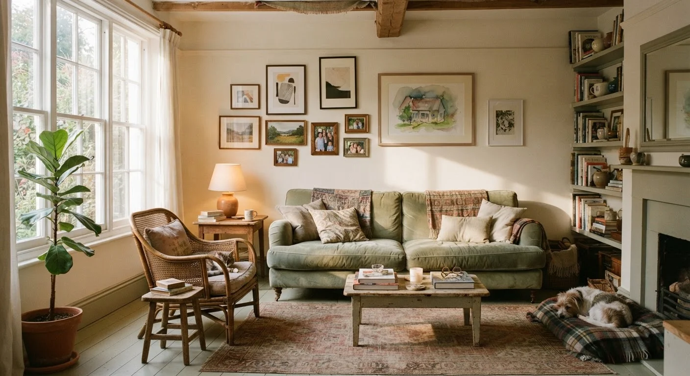
Why Rooms Feel 'Off' — And Why That's Fixable
That vague dissatisfaction with a room — the sense that something isn't working even though every individual piece looks fine — almost always traces back to a small number of structural missteps. The good news: these aren't taste problems or budget problems. They're proportion, placement, and lighting problems, and most can be corrected with repositioning and planning rather than purchasing.
The mistakes below are the ones that come up again and again in American living rooms, bedrooms, and dining rooms. If your space feels off, there's a strong chance at least one of these is the culprit.
Choosing a rug that's too small for the seating area.
Why it happens: Shoppers often underestimate how large a rug needs to be, and smaller rugs tend to cost less, making them tempting. The result looks like an island of furniture floating around a postage stamp.
Hanging artwork too high on the wall.
Why it happens: It feels intuitive to hang art at eye level while standing, but that's typically six to seven feet — well above where art reads naturally in a lived-in space.
Relying on a single overhead light source.
Why it happens: Builder-grade ceiling fixtures are the default in most American homes, and adding lamps feels like an extra step or expense.
Pushing all furniture flush against the walls.
Why it happens: It seems logical that clearing the center of a room creates more space, but the opposite is often true — pieces marooned at the perimeter create a disconnected, waiting-room feel.
Ignoring scale when selecting and mixing furniture pieces.
Why it happens: Furniture is often bought one piece at a time, in different stores, without holding physical dimensions in mind. A sofa that looked mid-sized in a showroom can dwarf a small room.
Using too many competing patterns or colors without a unifying element.
Why it happens: Individual pieces each seem appealing, but without a shared color family or repeating motif, the room reads as chaotic rather than layered.
Putting It All Together
Most of these corrections cost nothing — or very little. Pulling furniture away from the wall, rehinging art at the right height, and adding a floor lamp are afternoon projects, not renovations. Renters can apply nearly all of these fixes without touching paint or making permanent changes; our guide to renter-friendly decorating covers the full range of no-damage options.
Measure Before You Move or Buy
Most decorating missteps are rooted in skipping measurements. Before repositioning furniture, hanging art, or purchasing a rug, take actual dimensions of the space and the pieces involved. A tape measure and a few minutes of planning prevent the most common — and most frustrating — errors. Our room planning checklist walks through every step.
If you're working with a compact space, scale and arrangement matter even more. The strategies in our article on decorating a small living room address how to use light, layout, and proportion to make limited square footage genuinely comfortable rather than cramped.
Start with the one mistake that resonates most, make the fix, and live with it for a few days before tackling the next. Decorating decisions are easier to evaluate one change at a time.
57–60"
Ideal artwork center height from floor
This gallery-standard measurement aligns with average seated eye level and is widely used by interior designers as a practical starting point.
24"
Minimum rug extension beyond dining table
Interior design guidelines recommend at least 24 inches of rug beyond each side of a dining table so chairs remain on the rug when pulled out.
The content on this site is for informational purposes only and is not a substitute for professional advice. Always consult a qualified professional for guidance specific to your situation.