

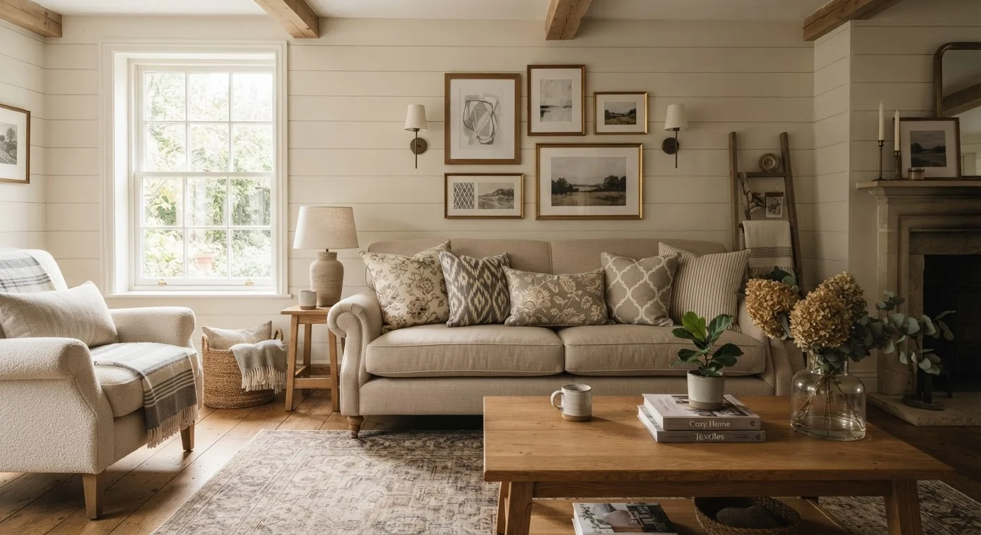
Why Pattern Mixing Feels Scary (And Why It Doesn't Have to Be)
Most people who shy away from mixing patterns aren't lacking taste — they're lacking a framework. Without a clear set of principles, it's easy to imagine ending up with a room that looks cluttered or mismatched. But professional decorators follow a handful of consistent rules that make pattern mixing predictable, even methodical.
The good news is that these rules are learnable. Once you understand how scale, color, and visual rest work together, you can introduce pattern confidently — whether you're working with a tight budget and thrifted pillows or investing in a patterned area rug as your room's centerpiece. For rooms where space is already a concern, see our guide to decorating small living rooms before layering in additional visual elements.
The Core Practices for Mixing Patterns Successfully
These principles build on each other. Start with the first and work your way through — each one narrows the decisions that follow.
Vary pattern scale intentionally — mix at least one large, one medium, and one small print.
Patterns of similar scale compete visually because the eye has no clear hierarchy to follow. When you mix scales, each pattern occupies a different register of visual attention, allowing them to coexist rather than clash. This is the single most effective rule for making mixed patterns feel deliberate.
Pull a shared color from your dominant pattern and repeat it across the others.
Color is the thread that ties disparate patterns together. When each fabric, even if wildly different in motif and scale, shares at least one color with the room's dominant print, the eye reads the group as intentional. This works even when the patterns are stylistically unrelated.
Use solid neutrals as breathing room between active patterns.
Every patterned surface needs contrast against something quieter. Solid-color textiles, painted walls, or natural wood surfaces give the eye a place to rest and prevent the room from feeling chaotic. Neutrals don't have to be white or beige — a deep solid works just as well as a pale one.
Limit the number of active, high-contrast patterns to no more than three per room.
There is a practical ceiling on how many patterns a room can absorb before it feels restless. Three is a workable upper limit for most spaces; in smaller rooms or rooms with busy architectural detail, two is often enough. Simpler, tone-on-tone patterns can expand this count slightly because they read more quietly.
Mix pattern styles (geometric, organic, abstract) rather than repeating the same motif type.
When you combine structurally different pattern types — say, a sharp geometric alongside a flowing floral — each pattern retains its own identity. Repeating the same motif type, such as two different floral prints, creates visual confusion because they seem to be competing versions of the same idea.
Quick Wins You Can Try Today
You don't need to redesign the whole room to start experimenting. These small moves let you test pattern mixing with low financial risk and easy reversibility.
If you're thinking about a broader room refresh, it helps to map out your approach before spending. Our room redecorating planning checklist walks through every step before you commit to purchases.
Common Mistakes and How to Avoid Them
Even well-intentioned pattern choices can go sideways. The most frequent error is using patterns that are all roughly the same visual weight — a medium-scale stripe, a medium-scale floral, and a medium-scale geometric compete rather than complement. Always anchor the mix with one dominant pattern and let the others play supporting roles.
A second common mistake is ignoring texture as a pattern category. A chunky knit throw, a woven rattan basket, or a linen pillow all add visual rhythm without introducing print. Mixing texture with print patterns gives the eye variety while keeping the room from feeling too busy.
Test Before You Commit
Before purchasing a new patterned piece, bring a fabric swatch home and hold it next to your existing patterns in natural light. Colors and scales can look very different in store lighting than in your actual space. Most fabric retailers and home goods stores will allow swatch samples or have a return window — take advantage of both.
Finally, remember that a patterned rug does heavy lifting in a room. It can establish the entire color vocabulary your other patterns pull from. Our guide to rugs as a room's foundation explains how to use that anchor effectively, and our look at accent walls covers when wall-level pattern makes sense versus when it fights the rest of the room.
The content on this site is for informational purposes only and is not a substitute for professional advice. Always consult a qualified professional for guidance specific to your situation.