

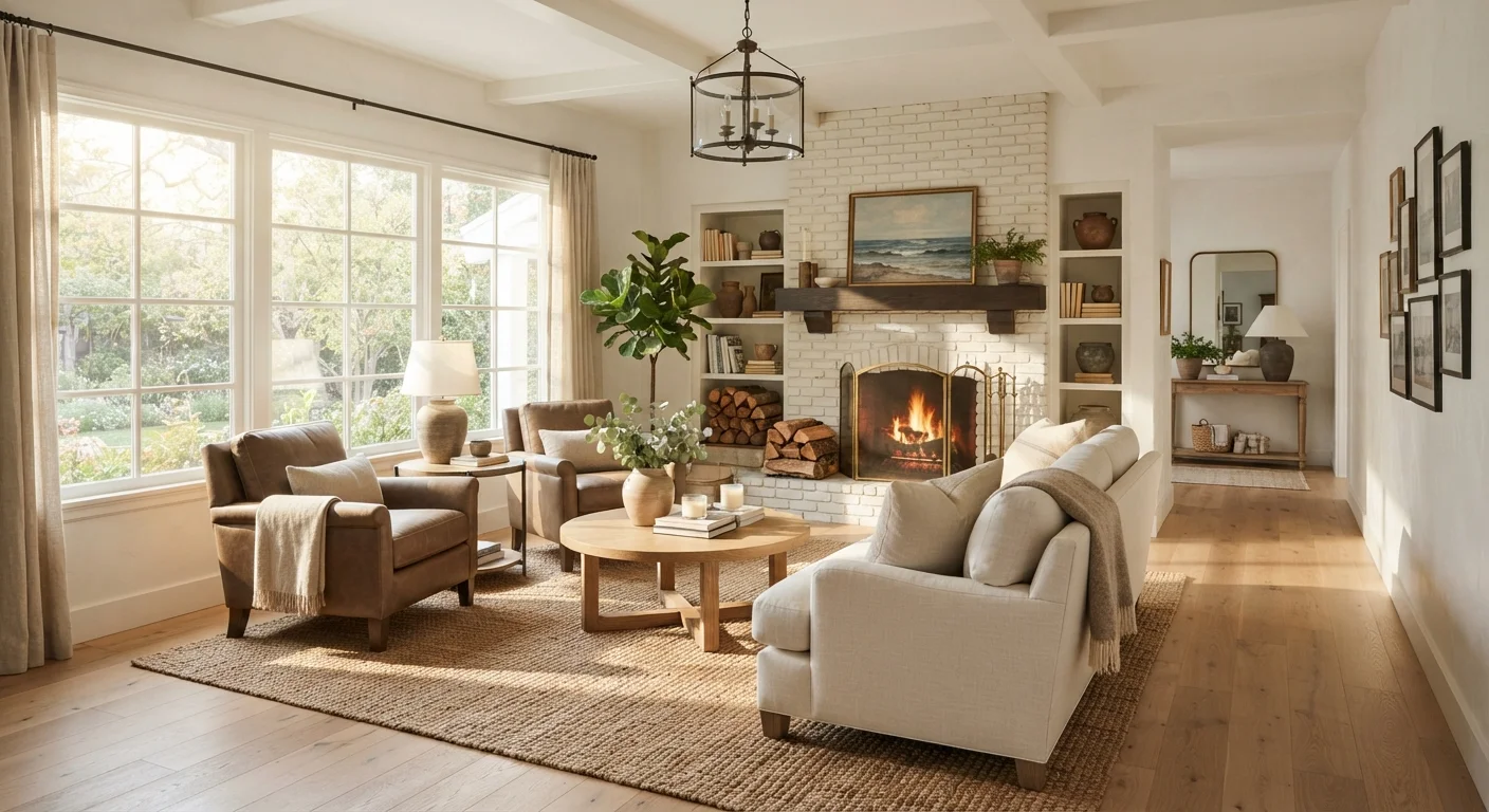
Start With the Focal Point
Every room that feels naturally comfortable has something to look at when you first walk in — a fireplace, a picture window, a media console, or even a bold piece of art. Interior designers call this the focal point, and it's the first thing to identify before moving a single piece of furniture.
Once you have a focal point, orient your primary seating toward it. In a living room, that means the sofa faces the fireplace or TV, not a blank wall. In a bedroom, the bed's headboard typically anchors the largest wall, often opposite the door. This one decision shapes everything else around it, making the layout feel intentional rather than default.
If your room doesn't have an obvious architectural focal point, you can create one. A large-scale piece of art, a dramatically lit shelving unit, or even a statement headboard can serve the same purpose. See how accent walls can anchor a room for ideas on building a focal point without major renovation.
Scale, Proportion, and Why Size Matters
One of the most common — and fixable — decorating problems is mismatched scale. A sectional that swallows a small room or a loveseat that floats lost in a large one both create the same result: a space that feels wrong without a clear reason why.
Before purchasing or repositioning furniture, measure your room carefully and sketch a rough floor plan. Note the location of windows, doors, and any architectural features. General guidance from interior design educators suggests leaving at least 18 inches between a coffee table and sofa (enough to reach a drink without leaning) and 30–36 inches on primary walking paths.
36"
Recommended clearance for main walking paths
Interior design educators and accessibility guidelines generally recommend 36 inches of clear passage on primary traffic routes in home living spaces.
18"
Ideal gap between sofa and coffee table
A gap of roughly 18 inches allows comfortable reach for items on the table without requiring occupants to lean or strain.
Proportion isn't only about individual pieces — it's about how pieces relate to each other. A substantial sofa pairs with a coffee table that's roughly two-thirds its length. Chairs that are too low beside a tall sofa look unintentional. When pieces feel cohesive in height and visual weight, the room settles into balance. For more on how common scale errors play out, common decorating missteps that are easy to fix covers the patterns that come up most often.
Traffic Flow and Functional Zones
A room that looks good in photos but frustrates daily life usually has a traffic-flow problem. People shouldn't have to squeeze past the edge of a sofa or step around a coffee table corner every time they cross the room. Mapping out how people actually move through a space — not just how they sit — is a key part of good arrangement.
Think of traffic flow in two categories: primary paths (how people move from room to room) and secondary paths (movement within the room, say from the sofa to the bookshelf). Primary paths need more clearance — 36 inches is a comfortable target. Secondary paths can often be tighter, around 18–24 inches.
Zoning is the second half of this principle. In an open-plan space, furniture can define separate functional areas — a dining zone, a reading nook, a work corner — without a single wall. Rugs are especially powerful zoning tools. Sizing and placing a rug correctly is often what makes a floating furniture grouping feel grounded and deliberate.
The Wall-Hugging Mistake — and What to Do Instead
When in doubt, most people push furniture against the walls. It feels safe, and it seems like it will make the room feel larger. In practice, it usually does the opposite — scattering pieces around the room's perimeter creates a disconnected, waiting-room quality with a dead zone in the center.
Pulling furniture inward, even just 6–12 inches from the wall, creates a more human-scaled conversation area and makes the room feel more purposeful. The space behind a sofa doesn't go to waste — a narrow console table there adds both function and visual layering.
Identify and orient furniture toward one clear focal point in every room.
Without a visual anchor, furniture placement feels random and rooms lack a sense of purpose. A focal point gives the eye somewhere to land and gives furniture arrangement a logical starting place.
Pull seating away from walls to create a defined conversation zone.
Wall-hugging furniture spreads pieces apart and kills conversation and visual cohesion. Grouping furniture closer together — even in a large room — makes a space feel lived-in and intentional.
Leave at least 30–36 inches on any primary traffic path through the room.
Paths that are too narrow make rooms frustrating to navigate daily and feel cramped even when they aren't. Adequate clearance keeps movement comfortable and prevents furniture from becoming an obstacle course.
Match furniture scale to the room — and to each other.
Pieces that are too large overwhelm a room; pieces that are too small float and look uncertain. Consistent visual weight across a grouping creates balance and makes a room feel curated rather than assembled by chance.
Use furniture groupings and rugs to define functional zones in open-plan spaces.
Open-plan layouts without defined zones feel unresolved and are difficult to furnish. Deliberate groupings signal how each area is meant to be used without needing walls.
Working in a genuinely compact space? The same principles apply, though with tighter tolerances. Decorating a small living room without it feeling cramped covers strategies specifically for rooms where every inch counts. And before you commit to a full rearrangement, a room planning checklist can help you think through layout, lighting, and priorities before moving anything.
The content on this site is for informational purposes only and is not a substitute for professional advice. Always consult a qualified professional for guidance specific to your situation.